
If you grew up with a familiar rectangular world map, Africa’s scale on a globe can be a surprise. Places near the poles often occupy much more space on that map than their real areas justify.
Africa has not changed size. The difference comes from how a curved surface is represented on a flat page—and from whether the chosen map is suitable for comparing areas.
Why Mercator changes the apparent balance
The Mercator projection, introduced in the sixteenth century, preserves local angles and makes constant-bearing routes straight. Those properties helped make it useful for navigation.
Its area distortion increases towards the poles. Greenland and other high-latitude regions therefore appear much larger relative to equatorial places than they do on an area-preserving map.
The US Geological Survey’s projection manual explains the different purposes and properties of projections. A map can be useful for one task and misleading when used for another.
How large is the difference?
Africa is roughly fourteen times the area of Greenland, despite their sometimes similar appearance on a Mercator world map. The American Geographical Society’s discussion of Africa’s scale uses that comparison to explain why the visual impression matters.
The comparison concerns area. It does not mean that every distance between two African cities is fourteen times a comparable distance in Greenland, or that one continent can be understood as a single uniform place.
Our map-reading guide offers more examples of checking exactly what a visual comparison measures.
What equal-area maps preserve
An equal-area projection keeps relative surface areas in proportion. It must still distort something else, such as shapes, because flattening the Earth cannot preserve every property everywhere.
Gall–Peters and Equal Earth are examples of equal-area approaches with different appearances. Neither makes every country’s outline and every distance simultaneously exact.
For learning the relative size of continents, an equal-area map is more suitable than Mercator. For another task, choose according to what needs to remain accurate.
A new development in September 2026
On 4 September 2026, the UN General Assembly adopted a “Correct the Map” text encouraging wider use of equal-area projections, particularly Equal Earth, where comparing geographical size matters.
The practical lesson is about choosing an appropriate representation. It does not mean that the Earth has been redrawn or that every use of another projection is inherently wrong.
Treat country-fitting collages as illustrations
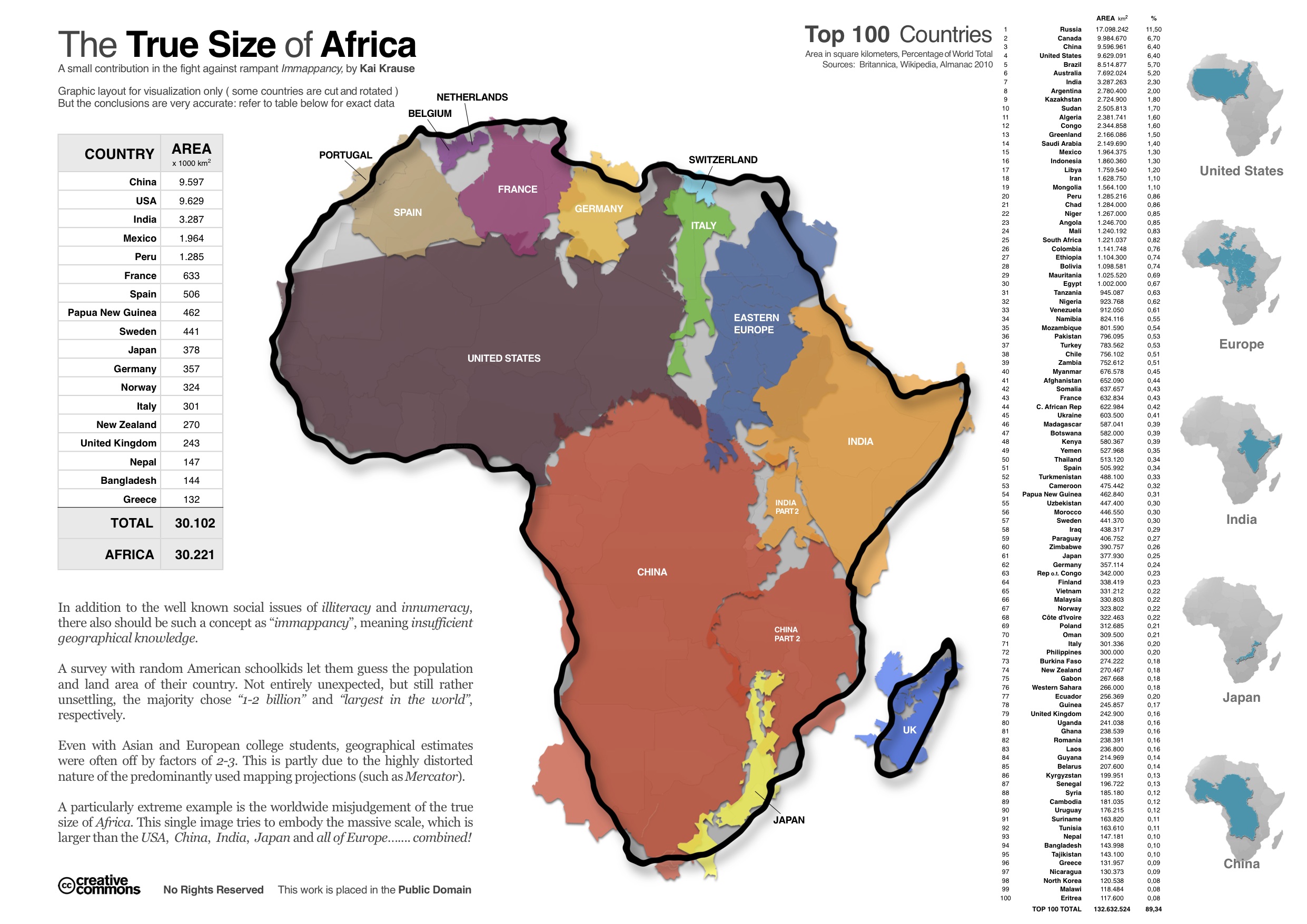
Collages that arrange familiar countries inside Africa can communicate scale memorably. But the shapes, area definitions and transformations need scrutiny before the arrangement is used as precise measurement.
Use a globe or a consistent equal-area map for a more dependable comparison. Then look beyond size to the continent’s many countries, environments, languages and histories.
Try a simple comparison
Find Africa and Greenland on a globe, a Mercator map and an equal-area map. Note what changes visually while the places themselves remain the same.
That small exercise can improve how you read every map afterwards. The most useful map is not the one that feels most familiar; it is the one whose design fits the question you want to answer.


Compare areas on the same basis
A country-fitting collage works by moving familiar outlines into an unfamiliar arrangement. It can make Africa’s area easier to imagine, but the pieces no longer show their actual neighbours, orientation or travel distances. That is the trade: a memorable comparison replaces ordinary geographic position. Use the collage to ask a size question, then return to a globe or an appropriate map for a location question. The two images can be useful together without pretending to do the same job.
Choose the map for the question
Before comparing maps, decide what you want to learn. Relative land area calls for one kind of representation; local shape, direction and a route call for others. A globe offers a further reference because it avoids flattening the entire surface at once, although its own size limits the detail visible. Switching between these views turns an apparent disagreement into a practical lesson in map design: the places remain the same while the chosen properties change.


0 comments:
Post a Comment